Seat: The Dreadfort
Lineage: First Men from the Age of Heroes
Words: Our Blades Are Sharp
Notable members: Ramsay Snow aka Ramsay Bolton after he was legitimized by King Joffrey Baratheon for the Bolton’s part in the Red Wedding.
Easily one of the reprehensible and evil characters in fiction, his favorite sport is “the most dangerous game” of hunting man. He allows captives to escape for a day before hunting them down with his hounds, who then feed on the poor soul’s corpse after they’ve been hunted.
Seriously, why the hell would anyone rally behind a family this fucking creepy?
Fun Fact: The wall sconces at the Dreadfort are human skeleton hands sticking out of the wall holding torches. Again: CREEPY!!
House Bolton
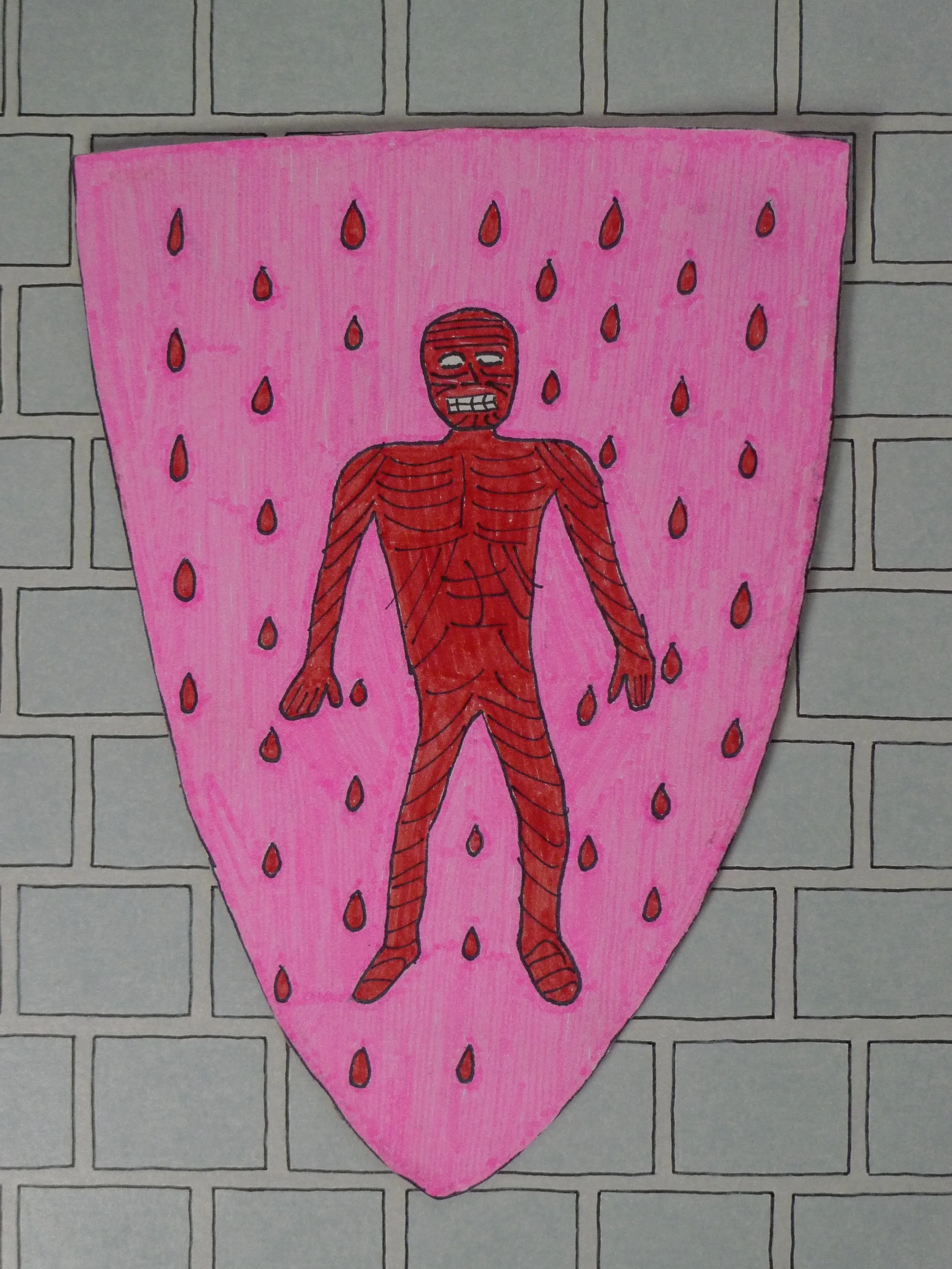
1st banner circa Dec 2014
Not only was this the first Bolton banner…this was my first banner ever!!! And oohwee does it show! The randomness of the blood droplets, the asymmetry of the body, and, ugh, the streakiness of using THIN pink Crayola marker. I clearly just dove right into this one.
Despite it’s appearance of the work of a skilled 6th grader, this banner holds a lot of importance to me. It’s like the movie ticket stub from the first date of your future spouse. A small token, but a token of the first step in a journey that has continued to unfold to this day. In fact, this website is the showcase of that journey, so it wouldn’t even be here without this banner.
It currently resides above my art desk, as a reminder of where I started and how far I’ve come. Whenever I hear praise about “talent”, I like to share this picture. Like Bob Ross said, “Talent is nothing more than a pursued interest.” Damn straight, Bob! Damn straight.
2nd banner circa Feb 2015
Re-done once I switched to color pencils, this one is slightly better. Better symmetry, but still raw. My detail skills weren’t good enough to tackle a human body with its skin removed quite yet. I held off on attempting this one again for a while while my skills sharpened.
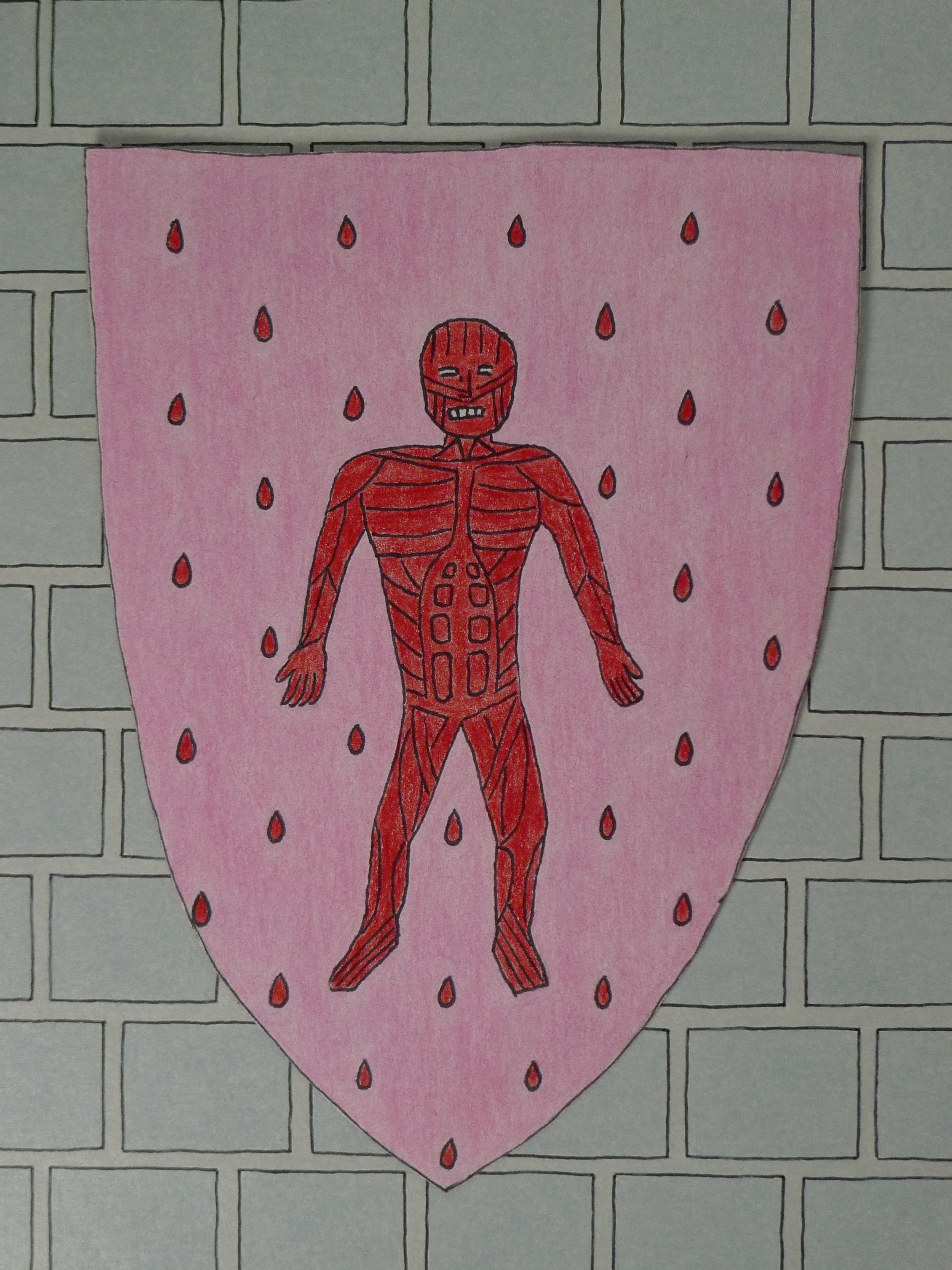
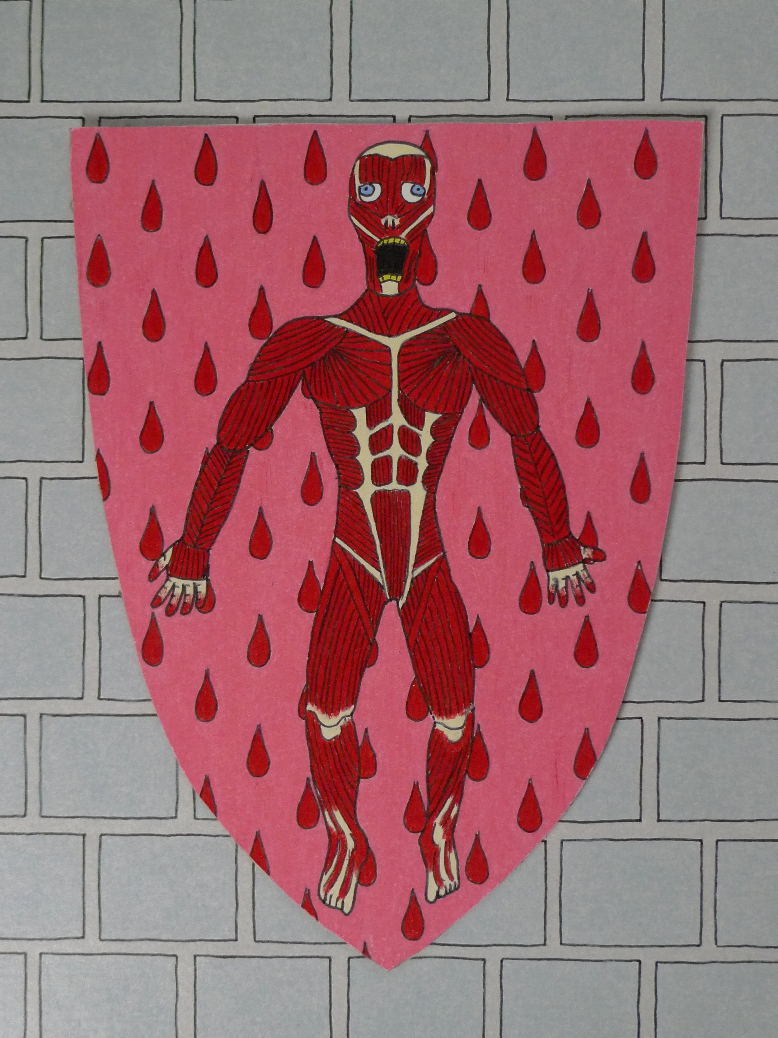
3rd banner circa Feb 2016
Finally getting back to this at the end of the project. This one had the recurring issue of making the subject too big for the banner. I didn’t care for this one as the pink color makes me taste bubblegum when I look at it, the artwork is clearly just the muscular system, and the eyes are just too cartoony. House Bolton deserves better!
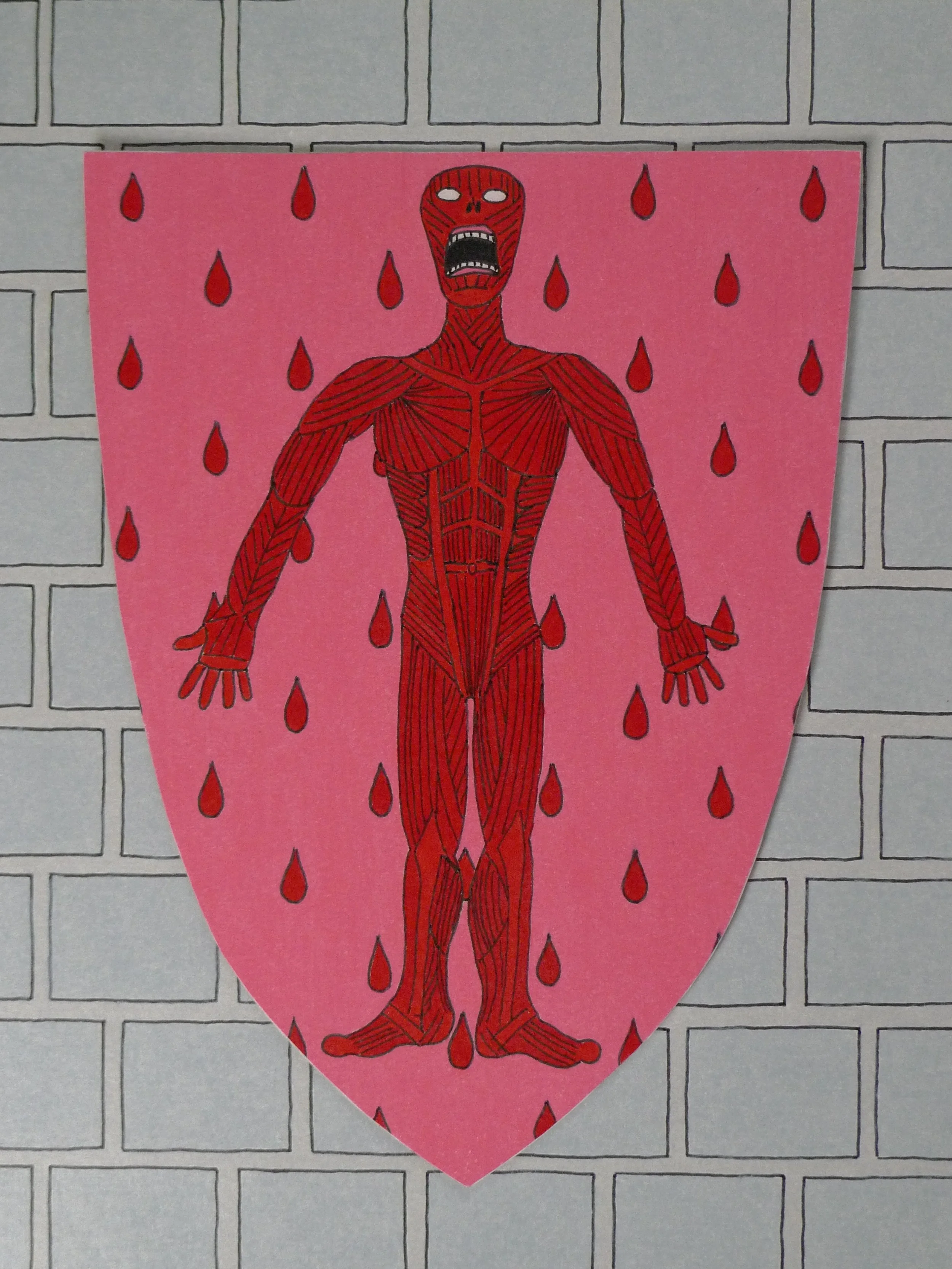
4th banner Mar 1, 2016
One of the shortest turn around times from the previous banner to the new one.
This was the last banner I did when the project wrapped (as it was also the first banner). I completed a version of each banner by Oct 2015, then spent several months re-doing and updating all the ones that looked extra dookie by comparison. That’s one of the issues with getting better at something; it makes your old attempts look silly and foolish. I try to take a positive outlook to old-time silliness.
Again with the bubblegum background, I was dead set on using the “pink” Prismacolor pencil because that was the color described in the book. The arms are a little long, but overall, I wanted to have a more fearsome looking banner. I was also flexing a bit with my hatching skills on the linework for the muscles. All banners at this time have that “cramped” look.
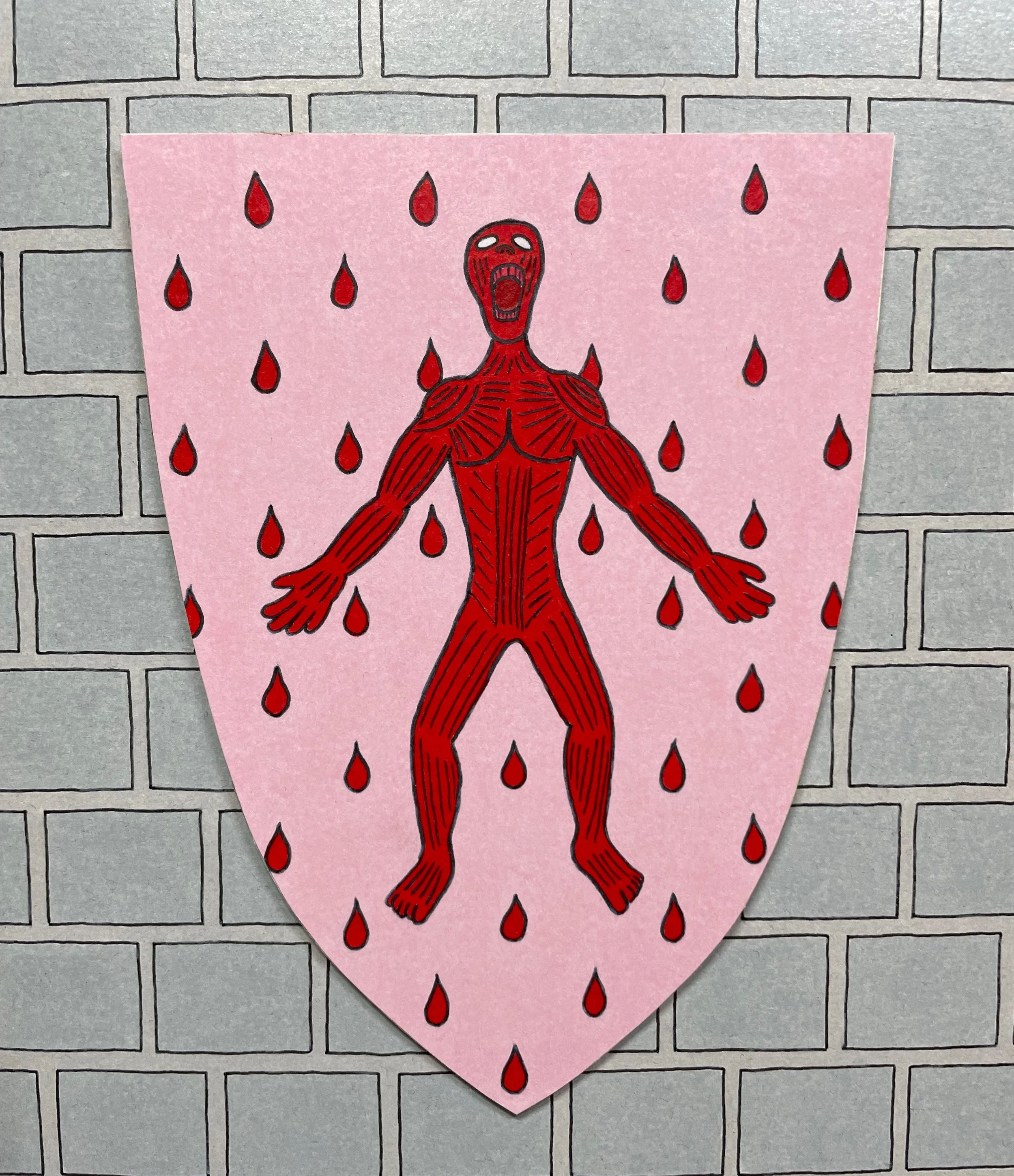
Final banner Aug 2, 2020
THAT PINK!!! THAT WONDERFUL, GLORIOUS, ELUSIVE PINK!!! THAT is the color I was chasing after the whole time. That is deco pink, which provides a beautiful contrast to the deep red of the droplets and flayed man. I pulled back a little on the line details, which I think works better. The flayed man’s look of horror is still present. The slightly lighter red teeth were inspired by the reaction of seeing teeth covered in blood, which is kinda disturbing to look at. Also, white teeth for this banner felt a little distracting.
I can confidently say that this banner is done. The colors are perfect, the blood is perfectly spaced, and it’s in that sweet spot where adding more or less would just take away. As my old theater director would say; Good job, no notes!